Pages

Tuesday, September 21, 2010

Art Analysis and Diagramming


Mediterranean Landscape, Pablo Picasso, 1952, Oil Paint
Colors, like features, follow the changes of the emotions. –Pablo Picasso
After a long internet search, I chose Pablo Picasso’s Mediterranean Landscape for my art analysis assignment. The bright colors and bold shapes of this piece caught my attention while surfing the web. I’ve never been a big fan of Picasso. It always seemed like all his work consisted of distorted faces or random objects. However, after doing some research, I found that his work has so much meaning behind it. Each piece is a place he visited or represents an emotion he felt. This particular painting evokes a happy emotion for me. It sets an image of vacationing in warm weather on the ocean somewhere.  I can picture myself running a hand along the bright white walls or sailing on the blue water in the distance. Mediterranean Landscape is beautiful, bold and energetic; that’s why I picked it.
          My positive response to this painting comes from the high energy of the diagonal lines; it really keeps the eyes moving across the composition. Using oil paints as a medium is an advantage to Mediterranean Landscape because the colors are so striking. Shadow is used in some places with really dramatic black or a contrasting color. The use of shadow gives the scene more light, as if it’s a hot, sunny day.   Picasso evokes my idea of vacation with bright realistic colors, sharp lines and thick, black outlines. The bold black outlines give the picture a cartoony feel. The sense of space in the painting almost seems shallow at first. After a second look, depth is showed through black space and diagonal lines moving backwards into the distance. This is also the reason why I enjoy this picture so much: it seems endless.
          This particular piece was finished in 1952, after Picasso’s cubism style was developed. The choppy shapes remind me of a collage, or synthetic cubism. Synthetic cubism is the use of cut paper fragments, wallpaper or newspaper, pasted into the composition. This style was developed along with Georges Braque and it analyzed objects by their shape. Although it was a different style period, I still believe it has some collage qualities. Overall, my perspective on Picasso’s work has changed greatly after analyzing this piece of art.  I discovered a lot about Picasso’s style, in terms of what influenced him and how he can have an effect on the people that view his work. 


 Concept Models
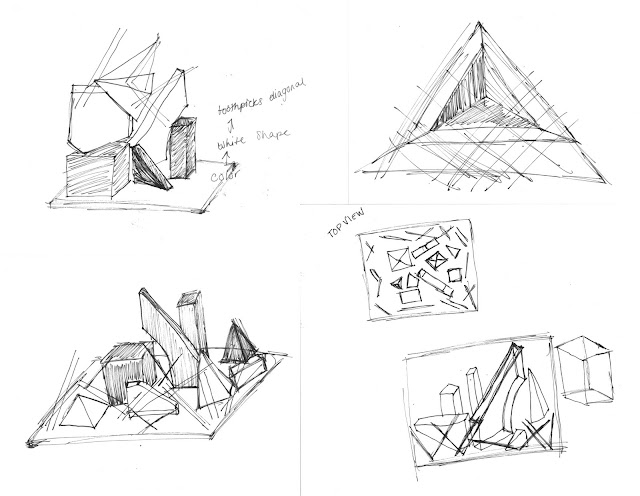
After analyzing Picasso's Mediterranean Landscape and picking out four elements in the painting. The ones that stood out to me and I wanted to emphasize when making my models were color, shape and the high energy diagonal lines. When overlapping these three overlays I enjoyed the way they seemed to be floating in space. This is how I wanted my models to look.  My first model is meant to be seen as a sort of a view point; looking through white lines to white and finally into the colored center. Out of all my models, this one was probably my least favorite because the toothpicks were too short.  With the second model, I chose to build as a pyramid from the ground up, starting with colored shapes, adding white shapes and finally making the top with lines. This idea looked interesting from the side but each layer wasn't interactive with the next. I decided in my next model, I would try to make them look more together. My third model had a square base and began with black lines around the perimeter. The class decided it gave an almost torturous look. white shapes came next, getting closer to the center and finally the primary colored shapes. My problem with this model was the lack of height. For my final model, I wanted height and an interaction between elements. My idea was to add a new element as I created deeper and deeper into the space; starting with line, adding shape and finally ending with all three. To portray the diagonal lines, I used toothpicks. These caused a problem with my idea to have them penetrating through the shapes because of their short length. When presenting, the class decided that I should use longer skewers.  My 6x6 model did not turn out how I had planned and I would like to redo it adding in the overlapping of shapes and the penetration of line.


Elements of Painting: (Clockwise) Shape, Color, Texture and Line


Concept Model Drawings: (Clockwise) Model 2, Model 1, Model 3, Model 4


Models: (Clockwise) Model 2, Model 1, Model 3, Model 4


Wednesday, September 15, 2010

Visual Privacy: Invotek Walls Systems


Invotek Element

  According to research done by Haworth, privacy disruptions created by sound and visual distractions are a major complaint in the workplace when evaluating satisfaction and job performance. In a discussion on privacy, Schwartz  stated "There exists a threshold beyond which social contact becomes irritating for all parties; therefore, some provision for removing oneself from interaction and observation must be built into every establishment." To this day, this statement still holds true for most. Everyone needs alone time and their own space.
     Invotek Ltd, located in Poole Dorset, UK, manufactures a range of partitioning systems. Invotek has five different types of systems with different options for each. They range in design to meet the needs of various clients and changing business environments.  These wall systems are completely removable and made to order. Each piece is designed specifically for its purpose depending on price, design and building and fire codes. They are even available in specified acoustical upgrades. The Invotek website states that, "The Invotek range of office partitions and glass wall partitions combine the best of modern materials with innovative design features that allow the end user to plan an office environment with total flexibility."

Winston Primary School
     The brightest and most exciting renovation found on the Invotek website was Winston Primary School in Bournemouth. The product used for this building was Invotek 75 and 100. "Invotek 75 and 100 are non-load bearing fully relocatable floor to ceiling partitioning systems, based on a steel framework with sound reducing and fire resistant panels, erected in a combination of solid, single and double glazed panels." This project was a remodeling of the reception and classroom areas. The objective was to use all sustainable materials, control sound and to create an overall enjoyable environment for the students.  The bright colors and shapes give a different vibe than the everyday rectangular glass panels that usually grace the doors and windows of schools. The design can still be fun but fixes the acoustical problems throughout the classrooms and be done in an environmentally friendly way. The results according to Invotek are "A suite of classrooms which is both practical and inspiring - and meets the current and likely future requirements of the school, the teachers and the pupils alike."


Glasswall Office Partitions

      "Invotek Glasswall is the partitioning system for the future. It provides the solution for those wanting a minimalist workplace environment; with discreet divisions of office space, suffused with light. Invotek Glasswall is sophisticated and aesthetic. It fulfils the need for privacy yet complements a feeling of space with visual continuity." The above picture is taken of a meeting room in The Department of Health.  The project's objective was to create a practical and pleasing design for meeting rooms and offices.  Invotek created this design using its own Glasswall System. "Manifestation was used to give individual identities to the rooms creating a stimulating visual landscape." The manifestation technique used gives a beautiful barrier between the meeting room and the hallway but it also allows for an open environment feeling.  Its a pleasing  and upbeat place to get work done. These partitions are a chance to display a logo or company colors. So many design options can be chosen with these versatile Glasswalls.

Invotek Glasswall Elite Office Space
 

Invotek Element, a more natural appearance.
    The Invotek partitions or as they say "walls of the future" are a designers dream! If an office is rapidly changing, so is the environment and the people in it. These walls sit on a track and can be easily removed and installed wherever they're needed. Its no wonder this product has spread so rapidly through Great Britain and parts of Europe. The partition is enough to block off a space but is still open enough to be part of the entire office. Visually, the Glasswall offices aren't very private, most of the walls are completely clear or have blocks of color.  The Element product is more of a practical office choice. It provides a more apparent visual barrier. This product has so many possibilities and options to create an incredible design suitable for any client.

Sources:

Tuesday, September 14, 2010

My First Post!

Hello blog world!
I'm so excited to finally be a Blogger! Stay tuned for my Interior Design III posts that I'll be updating all semester. Thanks for following!
-Sarah