Pages

Wednesday, December 15, 2010

Final Project

After two rough last weeks of the semester, a handful of all-nighters and a couple of tears, we're finally finished! It was a time consuming process but in the end seeing all of the work come together really pays off. I'm looking forward to creating the office space above Cafe Forma next semester. Looking back on the last few months, the only thing I would have done differently is manage my time better. More work in the beginning means less all-nighters in the end. Other than that, I am very pleased with the way my project turned out!

Tuesday, November 16, 2010

Process Presentation

Concept and Wellness Statement

     By incorporating color, shape and diagonal line, inspired by Picasso’s Mediterranean Landscape, into Landor’s new Seattle office, the work environment will inspire the team members. The office will promote creativity and energy and increase motivation towards projects.  An explosive interaction of color, shape, and diagonal line will provide differentiation between spaces. These elements will create transition, as one moves through the office, beginning with a strong emphasis on diagonal line and ending with a splash of color, preferably in the work space. Because collaboration and creativity are very important in the work place, communication areas will be readily available. Landor’s clients will marvel at the design statement of these facilities.
            People spend an average of 40 hours a week in the workplace. That being said, the wellness of these employees must be taken into account when designing an office space. Poor eating habits, stress and even physical problems with the body are commonly linked to ones place of employment. Taking time to eat a healthy lunch is often uncommon during a busy work day which often leads to fast-food or quick, unsatisfying snacks. Lunch break should be a time for one to relax and take a moment to relieve stress while enjoying a healthy meal. Spending too much time behind a desk can start to affect ones physical health leading to carpal tunnel syndrome or other CTDs. Addressing these problems while designing an office will provide a more comfortable and productive atmosphere for everyone.
            A building should be designed with its users in mind. Comfortable surroundings will impact human performance which in turn can increase clients and sales. In order to provide a more appealing space, the standard cubical desk day must come to a halt. Herman Miller products are made specifically for people sitting behind a desk all day, providing support and comfort. The most important problem being addressed in the office is stress and poor eating habits. A coffee shop and cafĂ© will take up the better portion of Landor’s first floor. This will give employees a place to relax and grab lunch in close proximity to the workplace without factoring in travel time. Break rooms will also be provided on the second and third floor for addition relaxation options. Wellness in the office will encourage workers creativity.
    Cafe Forma will be opened for breakfast and lunch to not only serve Landor employees but also Seattle's residents.  It will have a fun atmosphere where costumers can enjoy italian favorites such as paninis, flat bread pizza and wraps.  The design will involve the same elements as the attached office; diagonal lines, shape and splashes of bright primary colors. The italian food, inspired by Seattle's sister city, Milan, will allow employees to take more time for lunch and have a place to grab a snack during break. Comfortable lounge areas and dining tables provide a place to eat, meet up with friends, or just catch up on some reading. Cafe Forma will make a great addition to Seattle.


Floor Plan

CAD Floor Plan
 

Landor Project Template- Made in Adobe Photoshop CS4.

Poster 1
Poster 2


Monday, November 15, 2010

Landor Office Design Project: Process Work

My Design Process:


Bubble Diagram
Criteria Matrix
Mezzanine Slide Scribble


Lobby Scribble

  • The two scribbles above are both showing perspectives of the mezzanine and the second floor. The designs also show the diagonal columns penetrating through the space.

Brainstorming Pod Scribbles

  • Brainstorming pods are used to bring in the use of shapes. Four spaces, each its own unique shape, will each have a different type of sitting area inside. Beanbags, hammock chairs, air seating, etc. Below are images of seating ideas.


Pod Chairs


Mezzanine Ideas

Mezzanine

  • The above photo is the mezzanine design I chose. Its on the North and South wall and connects by a walkway. One side has stairs down and the other has a slide.


First Floor Block Diagram
Second Floor Block Diagram
Mezzanine Level Block Diagram

  • For my block diagrams, I made little models of each room with the appropriate square footage and moved them around on the floor plan. This was very helpful during space planning.

  • A quick idea for Cafe Forma. The use of diagonal line in the posts surrounding the center counter area will bring high energy and tie the wellness center into the rest of the Landor building. Splashes of color are going to be used in the furniture.
  • This is an image of a contemporary cafe by Jade Design Consultants.  I enjoy the primary colors with the black and white. its a very similar color scheme to my wellness center, Cafe Forma.  I also really admire the ceiling design over the bar.


Wednesday, October 13, 2010

Sister City


Seattle, Washington
  By evaluating a culture different from our own, we can learn how to improve our lifestyle. The words work and stress are used far to often in the same sentence.Creating a balance between work and home life can take the stress out of a daily routine.  In the United States, most health disorders are because of the unhealthy eating and living habits. For this project, research of Milan's wellness in their culture will be compared to that of the US.
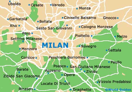
      Seattle, Washington, the "Sister City" to Milan, Italy is going to be the location of Landor's new office. Both cities are home to shopping, historical landmarks and great cuisine. These two locations also share the same Mediterranean climate and are bordered by mountains. A big difference however is Milan's lack of a large water feature. Seattle surrounds the Puget Sound, affecting the cuisine immensely, while Milan only has a man made lake city people escape to in the summer.
   Milan is a fashion powerhouse. The city is driven by well dressed workaholics who spend their down time on shopping. Even if shopping in "The Rectangle of Gold" is too expensive, locals head to the nearby outlet stores. The price tags still aren't cheap but hunting through runway fashions for a bargain is always worth it.  The outlet stores are located right outside the corso Vittorio Emanuele II, one of the oldest malls in the world. For a nice relaxing day, a walk through Fiera di Senigallia is a top choice. It is one of the many flea markets within the city.
   When shopping gets to be too much, relaxation can be achieved at any one of the famous spas such as, Lepri (owned by a famous hairstylist), Terme Milano, and the Bulgari Hotel. Spas however, are mostly sought after by tourists or wealthy vacationers. The city has a boisterous night life, a lot like Seattle, where happy hour starts after the work day is over and lasts well into the early hours of the morning. Hollywood is usually crowded with hip and artsy people while Loolapaloosa offers wild dancing. Meals are often a time to spend catching up with friends and family. Coffee, cafes, and happy hour are a time out from the stresses of work. These are the customs that keep stress levels down. Leave work at work and have a nice dinner with the family. Meal time in Milan is not rushed, everything else waits.
   A major difference between these two countries is eating habits. Americans generally get a quick hour to eat lunch so businesses can remain open throughout the day. In Milan however, they have whats called the three hour Pranzo. Italians take their time to gather around a meal and savor gourmet food. As for the Americans who are so busy rushing themselves, they usually grab a bite to eat at the quickest location, aka McDonald's.  Fast food restaurants are a pandemic spreading through the streets of the US.  They allow laziness and decrease the motivation to pack up a healthier lunch or pick a better choice.
   Looking at Americas all work and no play lifestyle compared to Milans work AND play lifestyle really shows where the stress comes in. Bringing a better dining environment into the work place may decrease the amount of fast food visits by employees stressing to eat within a short break. Taking another leaf out of Milans stress free environment could be to have a small cafe or convenience store within the building. It could offer magazines, snacks, coffee, cafe tables, and maybe WiFi. Adding small touches of relaxing activities at work would make it a more enjoyable and stress free environment.

Herman Miller


    On Wednesday October 6th, a Herman Miller representative gave an informative presentation on the company and its systems. Overall, the presentation was upbeat and interesting.  I had not known about many of Herman Millers policies directed towards the well being of its employees and the environment. For instance, employees must be within a certain distance of natural light. I personally loved hearing that. Who wants to sit in a cubicle under fluorescent lights all day? Definitely, not me. Another policy that really stood out was the company's need to blend in with its surroundings. This is accomplished beautifully at the world headquarters in Zeeland, Michigan. Herman Miller also stays environmentally friendly in their product design by renewing, reusing and recycling. They have over 10 "Cradle to Cradle" certifications on products ranging from seating to keyboard and mouse supports. This company gives the design world and the environment a beautiful future.
The Design Yard, Michigan.

 The first mind blowing product our rep introduced us to was the new Embody chair. According to Herman Miller, this chair promotes benefits for our body and our minds. Its understood that this chair allows more oxygen into our blood stream which improves brain function and boosts creativity. It's also advertised as a positive alternative to regular desk chairs, specifically for people on the computer all day because its provides back support and prevents stiffness. As if that wasn't enough to make an office designer drool, this chair is also environmentally friendly. The chair uses nonhazardous waste, renewable energy, recycled content, and at the end of its life-cycle, 95% can be recycled. Is that a chair or what?
The Embody Chair by Herman Miller

   Herman Miller addresses ergonomics in the office by a research-based set of products titled "Thrive." Thrive's entire idea is based off the phrase, "Feel better, Work better." This line offers ergonomic solutions in the office promoting healthy alignment and gives guidance on the correct way to use products to their full advantage. They think of people before the product and back it up with research. The Embody chair, as mentioned previously, is the newest part of the Thrive portfolio. The spine-like fingers supporting the back of the chair are made to constantly support the spine and keep a healthy alignment whether leaning backwards or forwards. Herman Miller looks at every aspect of their product and lets the consumer know what's in it for them.
   The entire presentation made me want to dive right into our new office design project. So many options and solutions are found through this company. One system that really stood out to me was the "Resolve" system. It's a pole based system that can be very useful for squeezing more into smaller spaces comfortably. Our rep informed us it can be very difficult to design with because of its lack of linage but also makes for an interesting outcome. Resolve allows a space to be fun and imaginative. Because this product is based on the 120 degree connection, it centers the worker and allows for maximum desk space. Learning about these systems; their advantages and disadvantages has really opened up a wide range of options for my office space. Thank you Herman Miller for a wonderful, informative presentation and the jar of honey!!

Tuesday, October 5, 2010

Site Analysis: Milan, Italy


     Landor, a graphic design group, is expanding their offices internationally. The city assigned to me is Milan, Italy, better known as the fashion capital of the world. It will be my job to include the contemporary aspects that represent the massive design industry there. Throughout this project I will be designing the interiors of an office space and developing design solutions for everyday problems people face in these settings. To begin the project, the site must be analyzed.

     Milan has a rich cultural heritage but it is best known for its huge design and fashion world. Streets, such as Via Monte Napoleone, are lined with fashion houses and couture shops. The cuisine is world renowned and the nightlife is famous. Milan is not only trendy, it is also very historical. The Italian city is filled with ancient museums, galleries, churches and one of the most beautiful cathedrals in the world located in Piazza Del Duomo.
 Piazza Del Duomo; Milan, Italy


     Milan is part of the Mediterranean climate. However, like any  other major city, the micro climate from the urban population causes weather to be more extreme. Summers, especially July and August can be unbelievably hot and humid. Along with the sweltering heat and humidity comes disease-ridden mosquitoes. Winter, although the city is mostly protected by mountains, are very chilly with temperatures occasionally dropping below freezing, rainy and covered in heavy fog. Average temperatures in the city's center are 39 degrees in January and 86 degrees in July. Wind is typically unusual except during the spring months when wind storms blow in off the Alps, often causing damages and injuries.

A heavy fog rolls over Milan in the winter months.
Many architects are redesigning Milan for  Expo 2015, the theme is Feeding the Planet, Energy for Life. Projects are underway throughout the city to rehabilitate unused  industrial buildings. This will impact the way I develop the new Landor office.  This affects technology and creativity and how they relate to designing the inside sustainably. The new office is located on Via Tortona, part of a business district. My goal is to ensure that the building fulfills its duties while blending in with its surrounding neighborhood.


Street view of new Landor office.


Tuesday, September 21, 2010

Art Analysis and Diagramming


Mediterranean Landscape, Pablo Picasso, 1952, Oil Paint
Colors, like features, follow the changes of the emotions. –Pablo Picasso
After a long internet search, I chose Pablo Picasso’s Mediterranean Landscape for my art analysis assignment. The bright colors and bold shapes of this piece caught my attention while surfing the web. I’ve never been a big fan of Picasso. It always seemed like all his work consisted of distorted faces or random objects. However, after doing some research, I found that his work has so much meaning behind it. Each piece is a place he visited or represents an emotion he felt. This particular painting evokes a happy emotion for me. It sets an image of vacationing in warm weather on the ocean somewhere.  I can picture myself running a hand along the bright white walls or sailing on the blue water in the distance. Mediterranean Landscape is beautiful, bold and energetic; that’s why I picked it.
          My positive response to this painting comes from the high energy of the diagonal lines; it really keeps the eyes moving across the composition. Using oil paints as a medium is an advantage to Mediterranean Landscape because the colors are so striking. Shadow is used in some places with really dramatic black or a contrasting color. The use of shadow gives the scene more light, as if it’s a hot, sunny day.   Picasso evokes my idea of vacation with bright realistic colors, sharp lines and thick, black outlines. The bold black outlines give the picture a cartoony feel. The sense of space in the painting almost seems shallow at first. After a second look, depth is showed through black space and diagonal lines moving backwards into the distance. This is also the reason why I enjoy this picture so much: it seems endless.
          This particular piece was finished in 1952, after Picasso’s cubism style was developed. The choppy shapes remind me of a collage, or synthetic cubism. Synthetic cubism is the use of cut paper fragments, wallpaper or newspaper, pasted into the composition. This style was developed along with Georges Braque and it analyzed objects by their shape. Although it was a different style period, I still believe it has some collage qualities. Overall, my perspective on Picasso’s work has changed greatly after analyzing this piece of art.  I discovered a lot about Picasso’s style, in terms of what influenced him and how he can have an effect on the people that view his work. 


 Concept Models
After analyzing Picasso's Mediterranean Landscape and picking out four elements in the painting. The ones that stood out to me and I wanted to emphasize when making my models were color, shape and the high energy diagonal lines. When overlapping these three overlays I enjoyed the way they seemed to be floating in space. This is how I wanted my models to look.  My first model is meant to be seen as a sort of a view point; looking through white lines to white and finally into the colored center. Out of all my models, this one was probably my least favorite because the toothpicks were too short.  With the second model, I chose to build as a pyramid from the ground up, starting with colored shapes, adding white shapes and finally making the top with lines. This idea looked interesting from the side but each layer wasn't interactive with the next. I decided in my next model, I would try to make them look more together. My third model had a square base and began with black lines around the perimeter. The class decided it gave an almost torturous look. white shapes came next, getting closer to the center and finally the primary colored shapes. My problem with this model was the lack of height. For my final model, I wanted height and an interaction between elements. My idea was to add a new element as I created deeper and deeper into the space; starting with line, adding shape and finally ending with all three. To portray the diagonal lines, I used toothpicks. These caused a problem with my idea to have them penetrating through the shapes because of their short length. When presenting, the class decided that I should use longer skewers.  My 6x6 model did not turn out how I had planned and I would like to redo it adding in the overlapping of shapes and the penetration of line.


Elements of Painting: (Clockwise) Shape, Color, Texture and Line


Concept Model Drawings: (Clockwise) Model 2, Model 1, Model 3, Model 4


Models: (Clockwise) Model 2, Model 1, Model 3, Model 4


Wednesday, September 15, 2010

Visual Privacy: Invotek Walls Systems


Invotek Element

  According to research done by Haworth, privacy disruptions created by sound and visual distractions are a major complaint in the workplace when evaluating satisfaction and job performance. In a discussion on privacy, Schwartz  stated "There exists a threshold beyond which social contact becomes irritating for all parties; therefore, some provision for removing oneself from interaction and observation must be built into every establishment." To this day, this statement still holds true for most. Everyone needs alone time and their own space.
     Invotek Ltd, located in Poole Dorset, UK, manufactures a range of partitioning systems. Invotek has five different types of systems with different options for each. They range in design to meet the needs of various clients and changing business environments.  These wall systems are completely removable and made to order. Each piece is designed specifically for its purpose depending on price, design and building and fire codes. They are even available in specified acoustical upgrades. The Invotek website states that, "The Invotek range of office partitions and glass wall partitions combine the best of modern materials with innovative design features that allow the end user to plan an office environment with total flexibility."

Winston Primary School
     The brightest and most exciting renovation found on the Invotek website was Winston Primary School in Bournemouth. The product used for this building was Invotek 75 and 100. "Invotek 75 and 100 are non-load bearing fully relocatable floor to ceiling partitioning systems, based on a steel framework with sound reducing and fire resistant panels, erected in a combination of solid, single and double glazed panels." This project was a remodeling of the reception and classroom areas. The objective was to use all sustainable materials, control sound and to create an overall enjoyable environment for the students.  The bright colors and shapes give a different vibe than the everyday rectangular glass panels that usually grace the doors and windows of schools. The design can still be fun but fixes the acoustical problems throughout the classrooms and be done in an environmentally friendly way. The results according to Invotek are "A suite of classrooms which is both practical and inspiring - and meets the current and likely future requirements of the school, the teachers and the pupils alike."


Glasswall Office Partitions

      "Invotek Glasswall is the partitioning system for the future. It provides the solution for those wanting a minimalist workplace environment; with discreet divisions of office space, suffused with light. Invotek Glasswall is sophisticated and aesthetic. It fulfils the need for privacy yet complements a feeling of space with visual continuity." The above picture is taken of a meeting room in The Department of Health.  The project's objective was to create a practical and pleasing design for meeting rooms and offices.  Invotek created this design using its own Glasswall System. "Manifestation was used to give individual identities to the rooms creating a stimulating visual landscape." The manifestation technique used gives a beautiful barrier between the meeting room and the hallway but it also allows for an open environment feeling.  Its a pleasing  and upbeat place to get work done. These partitions are a chance to display a logo or company colors. So many design options can be chosen with these versatile Glasswalls.

Invotek Glasswall Elite Office Space
 

Invotek Element, a more natural appearance.
    The Invotek partitions or as they say "walls of the future" are a designers dream! If an office is rapidly changing, so is the environment and the people in it. These walls sit on a track and can be easily removed and installed wherever they're needed. Its no wonder this product has spread so rapidly through Great Britain and parts of Europe. The partition is enough to block off a space but is still open enough to be part of the entire office. Visually, the Glasswall offices aren't very private, most of the walls are completely clear or have blocks of color.  The Element product is more of a practical office choice. It provides a more apparent visual barrier. This product has so many possibilities and options to create an incredible design suitable for any client.

Sources:

Tuesday, September 14, 2010

My First Post!

Hello blog world!
I'm so excited to finally be a Blogger! Stay tuned for my Interior Design III posts that I'll be updating all semester. Thanks for following!
-Sarah