 |
| Mediterranean Landscape, Pablo Picasso, 1952, Oil Paint |
Colors, like features, follow the changes of the emotions. –Pablo Picasso
After a long internet search, I chose Pablo Picasso’s Mediterranean Landscape for my art analysis assignment. The bright colors and bold shapes of this piece caught my attention while surfing the web. I’ve never been a big fan of Picasso. It always seemed like all his work consisted of distorted faces or random objects. However, after doing some research, I found that his work has so much meaning behind it. Each piece is a place he visited or represents an emotion he felt. This particular painting evokes a happy emotion for me. It sets an image of vacationing in warm weather on the ocean somewhere. I can picture myself running a hand along the bright white walls or sailing on the blue water in the distance. Mediterranean Landscape is beautiful, bold and energetic; that’s why I picked it.
My positive response to this painting comes from the high energy of the diagonal lines; it really keeps the eyes moving across the composition. Using oil paints as a medium is an advantage to Mediterranean Landscape because the colors are so striking. Shadow is used in some places with really dramatic black or a contrasting color. The use of shadow gives the scene more light, as if it’s a hot, sunny day. Picasso evokes my idea of vacation with bright realistic colors, sharp lines and thick, black outlines. The bold black outlines give the picture a cartoony feel. The sense of space in the painting almost seems shallow at first. After a second look, depth is showed through black space and diagonal lines moving backwards into the distance. This is also the reason why I enjoy this picture so much: it seems endless.
This particular piece was finished in 1952, after Picasso’s cubism style was developed. The choppy shapes remind me of a collage, or synthetic cubism. Synthetic cubism is the use of cut paper fragments, wallpaper or newspaper, pasted into the composition. This style was developed along with Georges Braque and it analyzed objects by their shape. Although it was a different style period, I still believe it has some collage qualities. Overall, my perspective on Picasso’s work has changed greatly after analyzing this piece of art. I discovered a lot about Picasso’s style, in terms of what influenced him and how he can have an effect on the people that view his work.
Concept Models
After analyzing Picasso's Mediterranean Landscape and picking out four elements in the painting. The ones that stood out to me and I wanted to emphasize when making my models were color, shape and the high energy diagonal lines. When overlapping these three overlays I enjoyed the way they seemed to be floating in space. This is how I wanted my models to look. My first model is meant to be seen as a sort of a view point; looking through white lines to white and finally into the colored center. Out of all my models, this one was probably my least favorite because the toothpicks were too short. With the second model, I chose to build as a pyramid from the ground up, starting with colored shapes, adding white shapes and finally making the top with lines. This idea looked interesting from the side but each layer wasn't interactive with the next. I decided in my next model, I would try to make them look more together. My third model had a square base and began with black lines around the perimeter. The class decided it gave an almost torturous look. white shapes came next, getting closer to the center and finally the primary colored shapes. My problem with this model was the lack of height. For my final model, I wanted height and an interaction between elements. My idea was to add a new element as I created deeper and deeper into the space; starting with line, adding shape and finally ending with all three. To portray the diagonal lines, I used toothpicks. These caused a problem with my idea to have them penetrating through the shapes because of their short length. When presenting, the class decided that I should use longer skewers. My 6x6 model did not turn out how I had planned and I would like to redo it adding in the overlapping of shapes and the penetration of line.
 |
Elements of Painting: (Clockwise) Shape, Color, Texture and Line
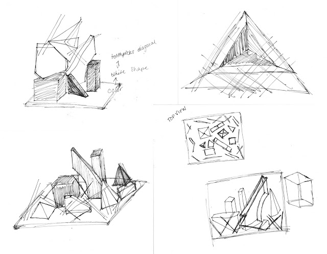 |
| Concept Model Drawings: (Clockwise) Model 2, Model 1, Model 3, Model 4 |
|
 |
| Models: (Clockwise) Model 2, Model 1, Model 3, Model 4 |


